Using the Workout Detail chart
The most powerful features in one of our most important charts
We work hard to make SportTracks easy to use, while still being the most powerful training platform on the planet — in addition to that, we also put a lot of effort into helping you understand how to use it. In this post, we'll take a close look at the chart on the Workout Detail page.
If you use SportTracks, you likely already use this chart quite a bit, as it's the central focus of the Workout Detail page. This post will go over its most important functions, so you can be sure you're using it to its fullest potential. And please note, in order to get this chart, your workouts need recorded data (it doesn't appear on manually entered workouts).
Metric Stacking
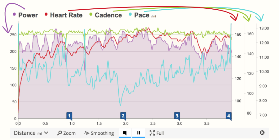
One of the most basic capabilities of the Workout Detail chart is to stack multiple metrics. This enables you to easily see how the various factors of your fitness relate to one another. We think it's an essential tool for performance analysis, yet, competing platforms either don't have it, or feature a clunky, less informative implementation of it.
In order to keep this chart from becoming too busy and difficult to read, you can stack up to four metrics at once. The first metric you select has a corresponding vertical scale on the far left side of the chart. As you stack more metrics to the right, their corresponding scales will stack on the far right side of the chart, in the same order:
TIPS:
- The top end of the chart doesn't always equal increased intensity. For example, Pace increases as it moves downward.
- Power is shaded-in because it's the first metric on the chart. When you only have two metrics on the chart, both will be shaded-in.
- Try overlaying your heart rate with your speed to see how they relate. Determine if there is a point that your heart rate increases and stays high. As you get more fit, see if this behaviour changes.
- Other interesting combinations to stack are speed and elevation/grade, and in running try stacking cadence with vertical oscillation and ground contact time.
Let's turn our attention to the toolbar at the base. We'll take a deeper look at the Time and Distance tool in a moment, but let's run through the other items first:
- Zoom: Like the name implies, this gives you a closer view of the data on the chart, so you can dissect the fine details of your efforts.
- Smoothing: This reduces the jaggedness of the data in order to show broader patterns. You can add lots of smoothing or turn it off completely simply by adjusting its slider.
- Interval Marker: These are points in the chart that show Laps (set by your GPS device), Hills, or Miles/Kilometers. When you change the type of interval in the toolbar, the map will update to display the same markers.
- Pause: If you use the auto-pause feature on a GPS device, or if you press Stop during a workout, the pauses will be displayed on the chart when you press this button.
- Full: This is the last icon on the right. It simply expands the chart to the full width of your browser, just like the tool in the SportTracks maps.
Time and Distance
The first option on the left is a drop-down menu that enables you to easily change the x-axis (or horizontal plane) of the chart to either Time or Distance. If you recorded a pool swim using a watch with a dedicated swim mode, you will have the option of Time or Length.
Why switch between Time and Distance? Runners typically prefer to use Distance, as it makes it easy to analyze runs based on miles or kilometers. However, it's critical to be able to switch a run workout to Time when analyzing the results of a Lactate Threshold test or time-based intervals.
Switching between Time and Distance changes how all of the data on the chart is displayed, including the scales on the sides. For example, on a run with timed intervals, if you change the chart to display Distance, the intervals will be different sizes (if you varied your speed). If you change this workout to Time, the intervals would be a uniform size (if you executed intervals with equal durations).
Interacting with the chart
When you hover your cursor over the chart, or when you tap on the chart using a mobile device, SportTracks displays a Hover Tip for the selected point in the workout. A Hover Tip is a little graphical box that displays the metrics for that moment in the workout; it's a snapshot of the metrics you've selected to analyze (pace, cadence, heart rate, etc.).
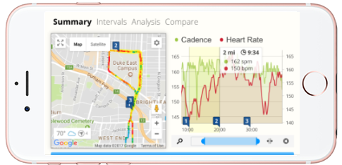
When using a mobile device, if you tap an Interval Marker, the selected interval will be highlighted on the chart and on the map, and the metrics for that interval will be displayed in a graphical box. This also works on desktop and laptop computers by clicking the interval marker.
When you're using SportTracks on a computer, try clicking an Interval Marker, and then hover your cursor over another Interval Marker. When you do this, the interval that you clicked will have a Hover Tip, and the interval that you're mousing over will have a Hover Tip as well. It can interesting to do this with an interval from an early part of a workout and an interval from a later part of a workout, to see if your pace faded, or your heart rate increased, etc.
If you click and drag your cursor on the chart when using a desktop or laptop computer, SportTracks displays the metrics for the selected segment, and highlights this section of the workout on the map as well. Doing this also makes the powerful Segment details button appear below. Clicking this button takes you to another screen that you can learn more about in this blog post.
Wrapping up
The more sensors you use to track workouts, the more data you'll have to stack and compare on the Workout Detail chart. Besides wearing a heart rate monitor when you run, you can also add sensors to track vertical oscillation, ground contact time, and running power. Some swim watches can track strokes, stroke rate, stroke distance, efficiency, and SWOLF, all of which you can stack on this chart.
Do you use these tools in a way that wasn't covered in this blog post? If so, we would love to hear how you use it in the comments section below! Likewise, if you have any questions about this chart, post it in the comments section and we'll reply to it as soon as we can. Thanks!
| Article written by Sam Mallery, Director of Marketing, Zone Five Software Inc. |
Comments
Metric stacking is very busy and hard to read. Why don't you stack separate graphs for each metric instead? Then you can see the relationships of each graph much more clearly.