Heartrate Zone Goal Monitoring
Powerful new chart stack options on the analysis page
HOT NEWS: The SportTracks analysis page just got another big update... You can now create charts showing cumulative weekly/monthly time in heart rate zones! This has been a popular entry on our feature request list for a long time (many people voted it up). We're thrilled to announce that it's available!
You can now create charts showing cumulative weekly/monthly time in heart rate zones!
In addition to that, we’ve also made some related enhancements that our "data nerd" customers are going to like, even if you don’t use an HRM. Read on for details...
Cumulative Heart Rate Zone Time
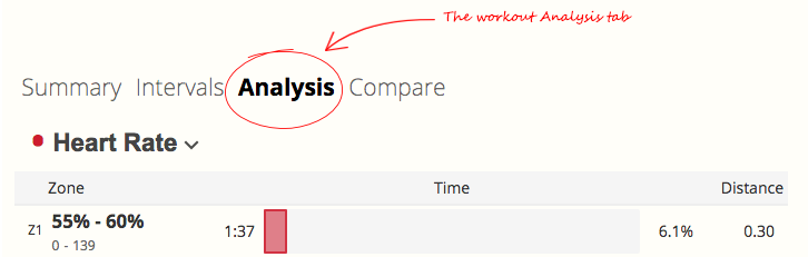
If you train with heart rate you likely have specific time goals to hit in each HR zone during a workout. Checking whether you hit your goals is easy. Just go to the Analysis tab on the workout detail page and look at the time in each zone:
On the other hand, if you have high-level HR zone time goals for an entire week or month, it’s a lot harder to see if you’re hitting them. With our new cumulative HR zone charts, it’s easy.
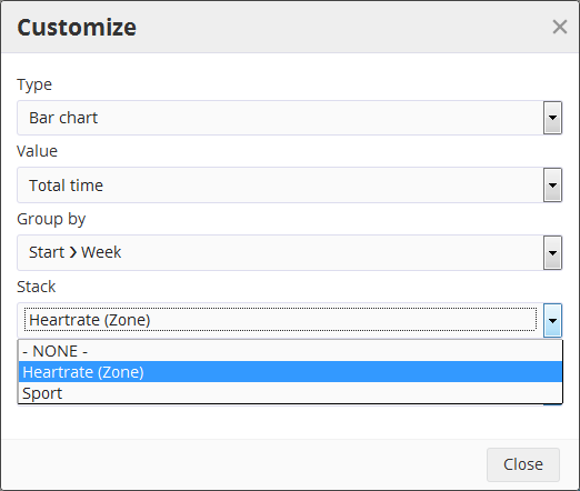
This is definitely worth trying out. Go to your analysis page and pick a panel that you want to turn into a Cumulative HR Zone chart (wide panels work best). Click the customize button in the upper right corner of that specific panel and set the options to look like this:
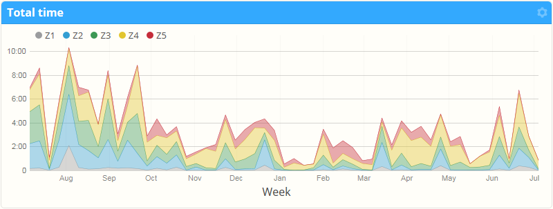
Click close and you should see a chart that looks something like this:
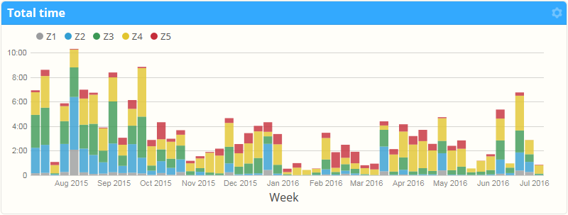
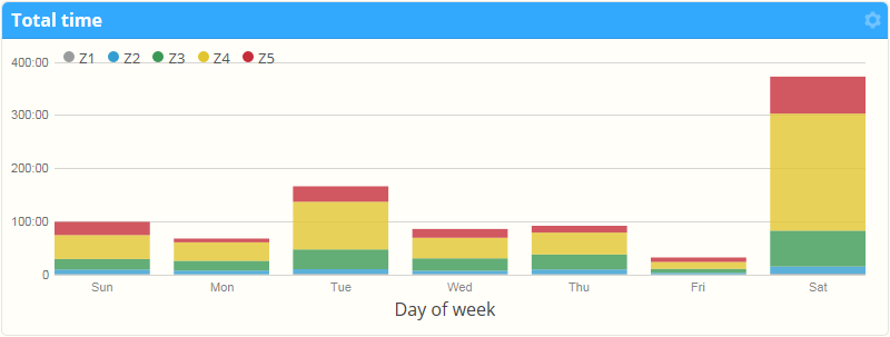
Click the “Week” button below the chart to select a different period for time aggregation. You can choose day, week, month or yearly totals. You can also pick other groupings, such as showing cumulative heart rate time for a particular day of the week:
Or by sport, or workout time or distance:
Combining this chart with the date filter located at the top of the page could be useful for specific purposes, such as switching away from an LSD run approach to a training plan with more intense, longer runs. You should see that change right there in the data by comparing the distribution from this season to last season.
PRO TIP: Use browser tabs or windows to show data side-by-side for different time periods.
Multi-sport Volume Breakouts
If you don’t train with an HRM, the Cumulative Heart Rate Zone Time feature isn’t going to be useful. But keep reading…
As we hinted at earlier in this post, we've added another new feature related to chart stacking: The ability to stack by sport. This can be super helpful if you’re a triathlete looking to monitor training volume across sports. This is how you set it up:
- Click the panel customize button
- Set Type to Bar chart
- Set Value to Total time
- Set Group by to Start > Month
- Set Size to your preference
- Hit Close
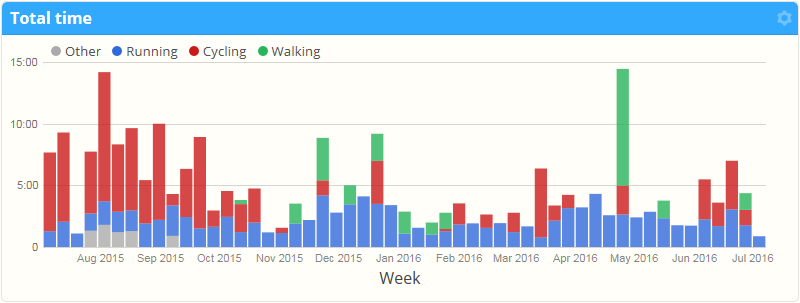
You should see a chart that looks something like this:
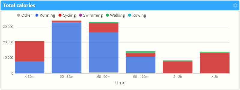
With the stack by sport option, you can select any metric that aggregates as a sum, such as distance, calories, or elevation gain (woot!). For example, you may be interested to chart sport-specific effort, which feeds into your training load model for fatigue:
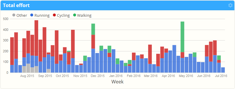
Compare the "Total effort" chart above with the one above it that shows "Total time". The fourth bar from the right illustrates how a relatively short bike ride can significantly influence effort level — and deeply impact Training Load.
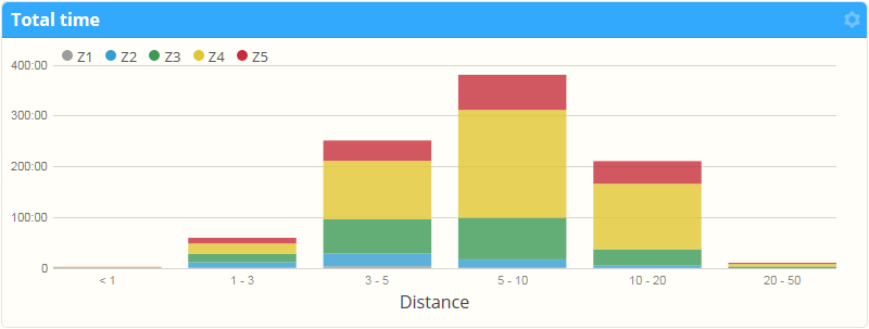
And just like the heart-rate zone cumulative time charts you can group by more than just the start date. Take a look at the chart below which shows (no surprise) just how many calories I burn on my daily commute compared to my long weekend rides. Interesting stuff!
It works on line charts too...
The same stacking options in bar charts are also available in line charts. This can be easier to read for long time periods with a small aggregation period, such as week:
Saving your customized reports
Once you’ve got a chart or series of charts you like, don’t forget to use the “Save” command so you can come back to it quickly, or drop a bookmark to the report on your computer or mobile device's browser. You can read more about our amazing report customization features in this blog post.
We hope these new features are useful for your training. And as always, we have more new tools in the works! Let us know what you think of the new analysis features in the comments below.
~Enjoy
Comments
A great feature especially for long term data mining, thank you for a great post.
Could you make a similar graph for tempo, that could be useful.
Is it possible to get a percentage of total time instead of seeing the amount in minutes? For example, I want to see if I am hitting 70% of my total exercise time in Zone 2 and 20% of total exercise time in Zone 3. Right now I can see that in terms of minutes but I can't do the math good enough to know if I am getting the percentages I want (yes, I am not that good with numbers!). Thank you.
Hi, I'd like a cumulative chart not based on my heart rate zones, but on my power zones or better. How can I achieve this?
Cheers
mario