Power has never been so critical for cyclists
Today we are happy to announce a new feature aimed at giving cyclists more insight into their power training.
You can now plot your critical power curve for a ride. But wait… there's more! This exciting feature also includes the ability to overlay a secondary metric. And that's not it! You also have the ability to show your critical power curve on segments (with overlay!). Let's dig into some examples.
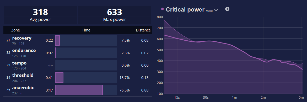
If you're training with a power meter, you will find the basic critical power curve on the analysis page when viewing power zone data:
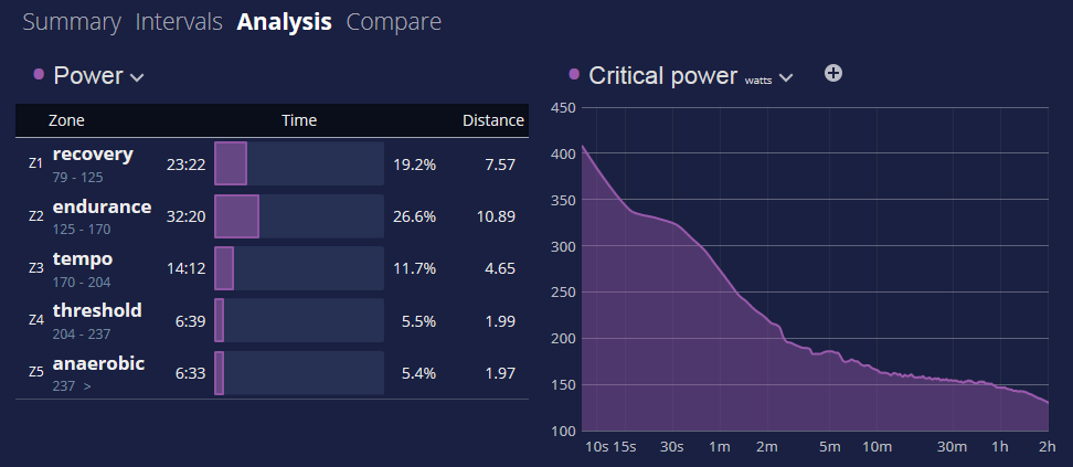
The curve above is showing the maximum sustained power output for various durations in the ride. Shorter durations will be your short hills, fast starts, and finishing sprints, while longer durations will be more endurance oriented. You can see these values in watts, or (if you've entered your weight) in watts / per kilogram to compare with other cyclists.
There is a great deal of literature on what these numbers mean, and you could spend hundreds of hours learning about the details. For now, here is some inspiration to put yourself in context:
To win the Tour de France you need to be able to hold 5.9 to 6.0 watts per kg for 30 to 45 minutes at a time, 3 to 4 times over the course of a 5 to 6 hour day in the mountains. Incredible freaks of nature.
Humbling. For mere mortals: a cat 3 rider will typically be in the 3.7 to 4.2 watts / per kilogram range at CP30.
And speaking of cats and power... a sprinting cheetah can put out 100 watts / per kilogram. Amazing!
Along with the basic critical power curve for a ride, you can also pick a variety of overlay metrics to show the corresponding average value at that duration. This is getting a bit complex, so an illustration should help. Below you can see the cadence overlay, and the hovertips showing CP1 power output.
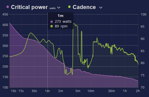
We suggest you switch between the cadence, pace, heart rate and grade charts on various rides to get a feel for what is being shown.
Segment Critical Power Analysis
One of the most exciting features of the critical power charts is integration with the segment analysis we rolled out last year. Let's start by looking at a ride with a lot of hill training. Go to the Intervals tab and select the Hills interval.
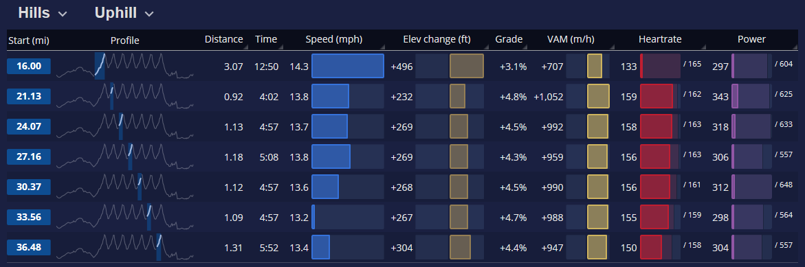
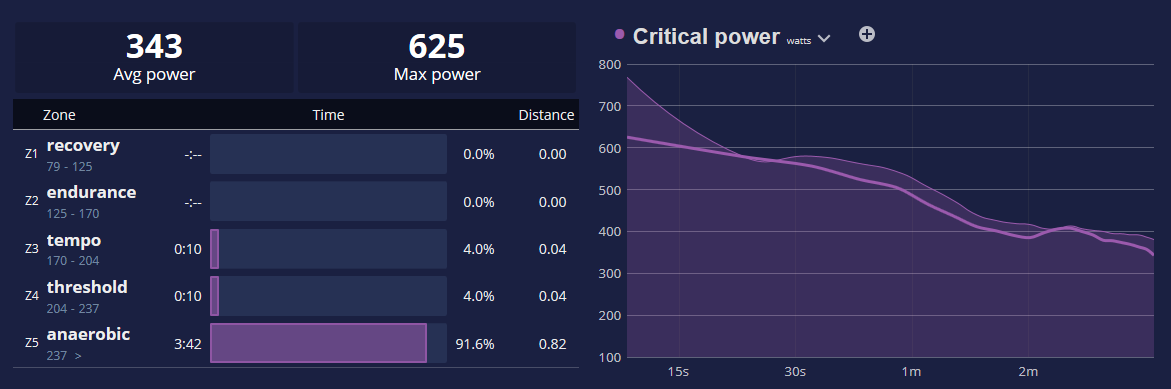
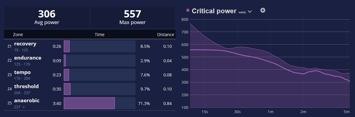
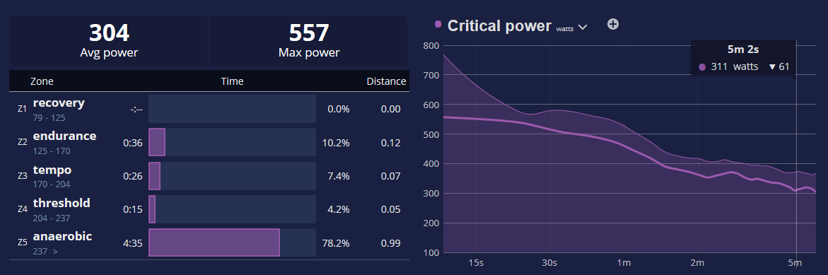
Here you can see SportTracks has auto-detected the hill climbs. From this view alone, we get a tremendous amount of info. But we want more! To view details for a segment, simply click an interval row for a hill. Up comes the segment detail view, which now has a new section showing the critical power for the segment (heavy line), along with the overall ride (filled area).
Using the segment selection arrows at the top of the page I can walk through each of my hills to see how power output varied as my ride went on.
Hill #2
Hill #3
And the last hill (some time later)
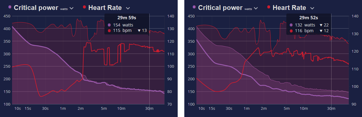
The segment critical power chart also has an overlay feature if you want to get really crazy with multiple data metrics.
To give you an idea of what this can do, below is a sample from a relatively flat ride showing side-by-side curves for the first half versus the second half of the ride. Take note of the CP30 power output (which has been highlighted) compared to heart rate in these two segments, and the variation from the maximal efforts of the entire ride. How do you think I did on my second half?
To appreciate the full power of this feature, you're going to need to import some of your actual workouts with power data and play around with the charts interactively.
Enjoy your power analysis!
Comments
Can you view a 'Power Curve' over a selected period of time. I mean could I select best power outputs from Feb 16th to March 23rd for example.
When are you planning to include a critical power chart for a selected period of time with an overlay of current ride ?
To answer the three posts above: We're doing a complete redesign of the "Personal Records" page this spring which will include things like filtering your records view by a date range, and including the "best efforts all rides" critical power chart, filterable by date range.
Thanks Aaron, awesome news.....
Looking forward.....
Hi, is there a way like strava.com to "calculate power based on given FTP", e.g. to see at least average power calculated when no power meter is used during the activity?