Training Load: Example Charts
All you need to know about reading training load charts
This is part 3 of our series on training load. If you just landed here, please read our other posts first for a background on training load Predicting fitness performance with training load and Training load: Science, history and application.
In this post we're going to turn to some examples so you get a better feel for how training load charts look:
All the examples below include the two training load charts you'll find on the Health tab which we've stacked vertically for readability.
Why constant training leads to diminishing improvement
The first example shows a 16 week training plan with a constant weekly intensity over the entire plan. This plan starts the 1st week of December and has a 1 hour workout of moderate intensity on Monday, Wednesday, Friday:
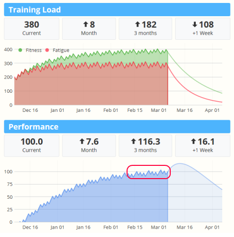
As you can see, fitness and fatigue are closely matched near the first few weeks of the plan, with performance actually in the negative range. As the season proceeds the longer term fitness gains are realized, and the gap between fitness and fatigue quickly increases, resulting in improved performance.
However, by the start of February the performance gains are slowing. Because we are training at a constant rate of 3 hours per week, we've reached the maximum potential performance near a value of 100. To push higher, we're going to need to increase our effort - either through longer duration, or higher intensity.
Increase performance with base building and recovery
The second example starts with the same plan, but after 6 weeks we begin increasing effort by 10% per week for 3 weeks, followed by a week of recovery where we back off. The plan repeats a second time, ending at about 2x times the original weekly effort:
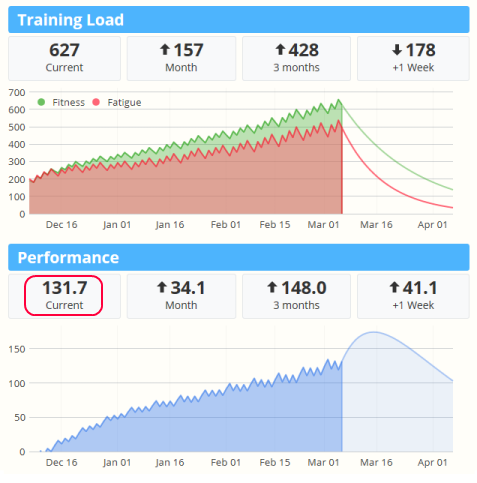
Two things should immediately jump out at you:
1. Instead of a performance plateau, we see a constant trend up.
2. Total performance is a lot higher (over +30%) ending at 132.
This is good. But there are a few more things we can pull out which are more subtle:
3. Fitness is improving, but so is fatigue. We should be mindful of our energy and intensity level as we increase, making sure each workout hits our targets.
4. Each workout has a greater effect as shown by the larger day-to-day spikes. A large spike could warn of an over training injury.
To illustrate the second point, lets look at an extreme hypothetical example.
How to overtrain and injure yourself in one chart
If a 10% weekly increase helps your build performance, why not increase by 20%, or 30%? And screw those recovery weeks, right? Who needs em? This last chart illustrates that scenario:
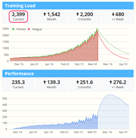
Here we see our performance nearly doubles to 235. However you'll also notice our fatigue has jumped by nearly four fold from around 630 to almost 2,400! And look at how large those daily performance spikes have gotten. While the long term trend is heading up, it's almost as if each day is struggling to push higher. It's no wonder as you can see fitness and fatigue closely tracking together rather than building a gap. This is what over-training looks like in a performance chart.
Putting it together with the taper
The final example shows two one-week tapers and their effect on your predicted performance. In the first example, the last 3 workouts rapidly diminish in intensity going into the weekend:
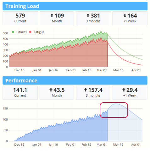
In the second example, we've chosen to simply take a week off before the race:
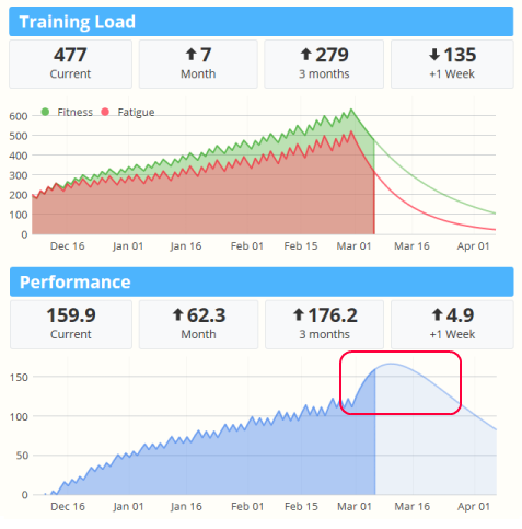
Using what you've learned, notice the difference of these charts in the last week versus the examples above. Compare the two tapers final predicted performance with the fitness and fatigue values.
Keep in mind the training load feature is a model which predicts performance. As with any model it is not 100% accurate so your peak taper timing may vary by a few days. If you look closely at the last two tapers you'll see variation in:
- Timing (the day the top of the curve peaks)
- Maximal predicted performance (the "height" of the top of the curve)
- Duration of peak (the "width" of the curve peak)
In the end, you still need to listen to your body (and your coach).
Any questions or comments on training load? Post below.
Comments
Hi GIno,
The Training Load and Performance charts can be found in the Health tab of SportTracks.mobi.
Best,
Sam
Hi Aaron,
At the end in your exemple, in theory of course, is it better to get a higher training load of 579 and 141,1 of performance or a higher performance of 159,9 and a training load of 477?
Tks,
Can anyone please give a short explanation of the 4 numbers in the top of charts
Traning Load & Performance:
Current
Month
3 Month
+1 Week
Thanks in advance.
Current: Fitness level
1 Month / 3 month: Change in fitness level since last month / qtr
+1 Week: Projected change in fitness level one week from now (assumes you plan workouts and model estimated effort)
Short and clear - thank you.
Hi. I recently signed up on the .mobi platform and managed to import all my history from Garmin Connect. I'm loving it, but I don't seem to be able to get the Training Load feature to work at all: the loading progress indicators just keep showing. Am I doing something wrong?
Hi
Thanks for this great explanation of the system and theory. I really like the scenarios based approach. I just feel that one scenario is missing. The scenario I am missing is where the performance graph is downwards, but one is still exercising. Is this also an overtraining situation?
Are there ranges of values that indicate whether you are in an optimal training area, in an overload zone, etc.?
I think that simplify for many to interpret the numbers.
Are there any recommendations / experiences on what value to interprete per month / 3 months / week?
For example: per month a value between x and y percent of current value is stagnant or increasing for performance.
The performance chart will go up when your performance is increasing. A certain level requires maintenance (to not drop), which increases with the performance level, so higher performance means higher maintenance level. For serious athletes especially multisport triathlete we see performance numbers in the 500 to 800, but more importantly is to look at your performance in relation to prior seasons or critical races. Higher values means the model is predicting better fitness.
Can I exclude certain activities from the calculation?
I like to track the miles on my commuting bike by adding them as a single block at the end of each month, e.g. 200km in 9 hours last month. Of course this causes a huge spike in the Training Load curve...
I don´t want to add these miles as individual activities, twice a day monday to friday.
You can edit the Effort value for any workout you track. To exclude a workout from the Training Load model, simply edit the workout and change the Effort to zero.
Hi Aaron,
Back to some your older comments: I understand when you say that is better not touching the Fatigue and Fitness recovery days to not to jeopardize the Banister model. And those two parameters, I suppose, refer to the r1 and r2 coefficients in its formula.
Nevertheless, I also note that if I change the Fitness Balance percentage (say from 40% to 80%) the Performance charts also changes dramatically.
Therefore, I would like to have some more explanation to the Fitness balance percentage and how to reference it to the Bannister model and finally, what is the recommended range for it not to jeopardize the model.
thanks,
Michele
You can read a pretty version of the formula with explanations here:
https://fellrnr.com/wiki/Modeling_Human_Performance#The_Banister_Formula
Fitness balance percent corresponds to the k1 parameter. k2 is calculated as a reciprocal of 100% so that changing the balance won't effect the total value scale, rather it just adjusts the mix. So for example, if fitness balance is 40%, k1 = 0.4 and k2 = 0.6.
So why do you use vastly different numbers than the orignial as default?
"The original paper used values of k1=1.0, k2=1.8-2.0, r1=49-50, r2=11."
Hi there,
I am using sprottracks since ...ever, I think. But honestly I have been using a lot of other tools also, including TrainingPeaks (TP), Strava, Garmin Connect, Final Surge, runalyze and Polar. These are the ones I do remember. The majority is using the already named TP visualization, and I must admit that after years, I do not get into the bannister logic and the given chart in the health metric side. I do love ST as analyzing tool more than all other tools I used, but I really do not like this single chart. I think it was a mistake not using the visualization which is state of the art in the market of analyzing tools.
It seems I will never get any benefit out of this chart. I still have to use other tools for this. Maybe I am to stupid ;-) I would love if you would rebuild this part of your tool or put in another "optional view" based on the viszualizations of TP, Strava, Garmin or Polar.
Just said :-)
I agree 100%, and have also been using ST forever (~25ish years of data in it). I find the ST implementation of a PMC to be a step backwards from their competitors. It is confusing and lacks documentation.
Pages